So You Want To Be A Pixel Artist?
My name is Tsugumo, and this is what I know.
Chapter 3: The Gradient Tool Is Evil
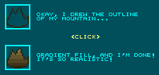
Yes, that's right. The gradient tool is evil. "What?! Madness! How else would you make shading in a tile! The gradient tool is the greatest tool known to man!" Okay, I'll go along with that a bit...The gradient tool CAN be used for good...Unfortunately, most people don't understand the difference between good and evil in this case and use it like a madman. What does this result in? Well, basically you end up with people doing this:

Now look at that...Does that REALLY look like a mountain, which is made up of random rocks/dirt, jagged edges, and so on? It looks more like a flat piece of paper someone was testing their dying brown marker on. The main problem with the gradient tool is that people try to use it for EVERYTHING. This ends up with perfectly rounded pipes, perfectly shining mountains, perfectly smooth bricks, and so on...Look around the room your in...How many things in there shine as if they had a gradient just splattered on them...Even your walls probably have nicks and scratches in them. The wood on a chair probably has a bit of paint peeled, or grooves, or what have you. Generally the things that CAN get away with using a gradient tool are manufactured, shiney brand new things. If you're doing a game set in the future, where everything is robots and metal and such, you can use the gradient tool a bit more here and there...But don't forget, unless that wall has never been touched, there's a good chance there are probably some imperfections here and there. First off I'll show some examples of gradient VS non gradient tiles...I'll use the objects I mentioned above even...A pipe, a mountain, and a set of bricks:

Okay, so we have our pipe, mountain, and brick wall, filled in with the gradient tool. Now that IS a pipe...that IS a mountain (well, if you use your imagination)...and that IS a brick wall. But they all look like they're made out of shiney plastic. And hey, if that's what you're going for, then by all means use the gradient tool, but if you're drawing graphics for an area that's been around for a while, then you don't want "perfect" things in it. So I went and redid the tiles, this time going pixel by pixel instead of using the gradient tool:

Now that pipe has been around a while. It's not shiney and brand new, it's got some age to it. It's much more interesting to the eye than the gradient pipe. And while it still has the round feeling to it, it's got pixels that break that up so it's less monotonous. The mountain now looks MUCH more like a mountain. It uses all the shades of the gradient mountain, but this time uses them to create forms in the shape. Small jagged corners and shades exist, giving it more of a feeling of depth...There IS a little bit of gradient here and there, but it's only a few pixels, no reason to even use the gradient tool. Then there's the brick wall, which if I were actually making it for a game I'd use a much less neon-white for it so it's not so contrasting and doesn't bug the eye so much, but I'm just using the shades from the gradient one. The bricks aren't perfect bevelled rectangles...They are, again, dented and scratched, irregular, more interesting to look at.
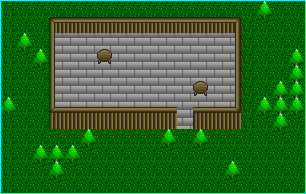
So just WHY do I hate gradients so much...The fact that a pipe doesn't look older and worn can't be the only reason. Well it's not. See, it's not so much individual tiles that look bad with gradients...It's when you put them onto a map all together. Here is a log cabin in the middle of a forest:

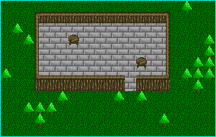
"What?! What do you mean that looks bad! Look! It has gradients! It's professional!" Well, I hate to break it to you, but gradients are NOT professional...They're just "popular". It's like the lens flare filter in paint programs. It was cool and different when it first appeared on the scene...But then everyone horribly abused it until now when people hear "Look, I made a lens flare on my guy's sword! Isn't it cool?!" they burst out laughing. Basically, though it takes more work, if it's a pre-made tool, you probably don't want to use it much. "But look at those amazing trees! They're not just a NORMAL gradient...They're CURVED gradients! It's astounding! The peak of perfection!" Well, if you ever start growing shiney green paper cones with brown cylinders under them in your backyard, then you can mock me in your head as you read this. Now I've taken the same tile set, the same map, the same colors, etc. and redone the shading by hand:

Now compare the two...Which one looks more like "wood"? I'm still not sure why I decided to go with grey bricks for the floor for this demonstration, but hey, go with it for a second, heh...The trees still have a light source hitting them, it's just that instead of big flat color shades, they have "dots" of color, like leaves of a tree. Keep in mind that this map is still ugly, because of it's general layout and the tile designs and such, but this part of the tutorial is not about layouts, it's about textures.
Back to main...
