So You Want To Be A Pixel Artist?
My name is Tsugumo, and this is what I know.
Chapter 2: Obliterating "The Grid"
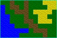
The infamous grid...Just what IS "the grid"? Here's a horribly obvious example of it...and keep in mind that a LOT of games look like this:

The grid is the thing that tells the player "You're not in an actual world...You're just walking around on a bunch of tiles." Now while this is true, and the grid really IS there, we want to create the illusion that it's not. The greatest thing you can do when making a grid of tiles, is to make it look like it doesn't exist. Here are some examples from Albert Odyssey (first shot) and Final Fantasy 3 (second and third shots):

Now these games are quite successful at eliminating "the grid". Try to figure out where a tile section is on the bottom center of the first shot...or on the middle of the second shot...or on the upper parts of the houses in the third shot. It's hard, isn't it? THAT is eliminating the grid. You can get a general idea that things line up, but it's difficult to tell where each tile begins and ends. It's easier on parts like the brown roof in the first shot, the rug in the second shot, and the snowy ledge and grates in the third shot, but hey, you can only do so much, heh.
So back to our example of the ugly grid...Throughout parts of this tutorial, I'm going to go through and explain different ways to break the grid and hopefully by the end we'll have pretty much obliterated it. But we'll start at the beginning, by taking the third grass tile from up in the grass section, and getting rid of it's grid. I chose that tile because like I said before, it has chunks of blank that will ruin it when it's displayed on a map. Here's what I mean:

Now in the first shot, you can see what I mean. I've taken that random spray grass tile and put it down in a large area. You can EASILY tell it's a grid of tiles...If you don't understand what I mean, I've circled the most obnoxious area that looks the worst, and you can see that shape of green is repeated every few pixels (16 to be exact, heh) throughout the grass. This is FAR from natural looking grass. In the second shot, I messed with a few pixels in the big ugly area (which was the top right and bottom left of the tile, as you can see if you look)...A little bit closer, the big annoying chunk is gone, but I've created another problem, and outlined it with a box. There are horizontal "lines" going along the tile. They aren't ACTUAL lines, but they're enough dots that the eye connects them into an imagined line. There's also a small blob of bright green that gets repeated, and if you stare for a minute, the blob and the imaginary line work practically as if there were actual full lines drawn down...Very distracting and ugly.
So that brings us to the third example. Here, I've gone and broken up that horizontal line of pixels (by adding dark green to it, so there's less of them to make the line up, and adding lighter green pixels above and below the line so that instead of just a series of horizontal lines, they break up into L shapes and such that break the pattern). Unless you're either lucky or have a LOT of free time, you can never COMPLETELY get rid of every trace of grid (unless you just go with a checkerboard pattern of pixels, but then that doesn't look random and natural). So you have to stop somewhere when you feel you have a good balance between the random look of grass, and the lack of major "grid points". If you look at the last one, you CAN still see a vague grid of light grass splats (this is caused by having too many of the same color pixel together...To fix it I would add in some darker shades into the chunk), but compare it to the first set of grass and you can see that it's a lot nicer to look at.
This imaginary graphical grid in the tile texture is the main problem most people have...A lot of the time they don't really notice it because they simply think "I have random green dots in a tile, so this is a grass tile, and I can just throw it all over the place...Now I can move onto the next tile." But it doesn't work like that, heh...You have to look at how your tile will look when it's on a map. If you have a tool in your paint program that lets you select an area of the screen and then draw a box and it'll fill up that box with the area you selected repeated, that's the quickest way to check if things line up okay. Otherwise, if you're programming your game as well as doing the art for it, make up a quick map with just the tile and see how that looks. Basically it just takes experimentation until you get it looking good.
Back to main...


