So You Want To Be A Pixel Artist?
My name is Tsugumo, and this is what I know.
Chapter 15: Running In Cycles
A brief update: Chapter 12 marks the start of a new set of tutorials, 4 years after Chapter 11 was completed. I've learned a lot since the old chapters, and I now know the answers to questions I had back then...as well, some of the information from older chapters is not necessarily "wrong", but not the way I understand or do things now. The previous chapters are still solid resources, but in the new chapters I'll be correcting some of the things I feel need changing. Keep in mind though, that the best thing you can do to get a solid understanding of pixel art is to read all the chapters, from the first through to the last instead of just skimming through little bits that seem interesting at a glance. I tend to go off on tangents and get sidetracked easily because I have a lot to explain, so a chapter will often cover more than what its title describes. Now then, let's begin...
In an earlier chapter, I covered doing a walk cycle for a 16x16 RPG character. That's all fine and dandy if you happen to be making an old-school RPG (a lot of people were, back when I wrote that chapter)...but nowadays, odds are you're going to be working on something larger, especially if you're planning to do this for a living. So now we're going to jump to animating large characters running. Let's take a look at some run cycles from Capcom VS SNK:


Now Capcom VS SNK is a fairly new game. This isn't a game from the SuperNES days, or early NeoGeo days. Capcom has refined their style, knows what they're doing, the sprites look great...but check out this sprite from back in the day:

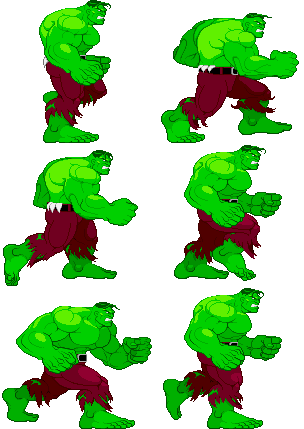
Pretty terrible in comparison...and yet, if you look at the old sprite and the new ones, what do you notice is the same about them? They both have 6 frames. 6 seems to be the magical number of frames for a run cycle. 2 frames can be done, if you're making a NES game. 3 or 4 frames would do a SuperNES game alright. If your sprites are small, you can get away with less frames. But 6 is the lowest number of frames you need for a convincing run cycle with characters between, say, 32x32 all the way up to super-huge (96x96+). In fact, if you watch anime, you'll often see 6 frame run cycles. Now you can go more than 6, and a lot of games do now that graphics have improved so much...but you don't have to. Generally if you have a large bulky character, you're going to want to go up to 8 frames and give him some momentum shifting (so each step has more "recoil" than a little character). Capcom's Hulk sprite is a good example of this:

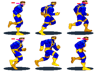
That's one huge bulky character...and he's got a 12 frame walk cycle. Generally a walk is slower paced, so it can help to have more frames for a walk cycle than a run cycle in a large character...plus again, the sheer size and weight of him means he's going to need more frames to make a convincing animation. Now you want to be careful not to get into too many frames...this is the problem I have with a lot of American animation, and I've mentioned it in an earlier tutorial...too many frames can ruin the "snap" of a motion. I love Batman: The Animated Series, and most of it's spinoffs that use it's style...it looks great visually...but they all have the same problem. Batman goes to punch or throw an enemy, and there are just way too many frames in the move, which ruin some of the impact it was supposed to have. There's a time and place for extra frames, but action scenes should start dropping frames to convey speed. A punch that goes from the hip to fully extended in one or two frames will feel much faster and have much more impact than a punch covering the same distance in 8 frames, even if those 8 frames are played fast enough to make the time duration of both exactly the same. That's why while I study animation of all kinds (even 3d), I keep coming back to anime for action. It also works out in our favor, because it means less frames to draw, heh. Too many frames and you can end up with something like Cyclops here:

17 frames...WHY?? Ignoring for a second that his feet are twisting weirdly, there's just NOT a need for THAT many frames of animation for this character. He's not big and bulky, he doesn't have a bunch of secondary animation (armor or cloth that shifts or flaps around as the character moves)...he's just excessively smooth for the sake of being excessively smooth. The artist could've done something nice in 6 frames and used the other 11 frames worth of time to work on something else. Don't make things harder on yourself than they have to be.

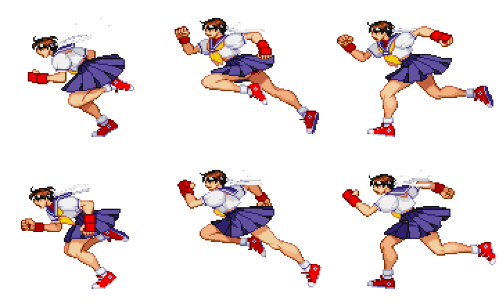
This is a run cycle of Sakura from Street Fighter Alpha 3...this, to me, is a totally solid run cycle, and is actually one of the ones I first used to learn how to make them. This has all the key points of a generic running motion (whereas the Mai or Joe sprites from the top of the page have highly unique runs...Mai's arm never leaves her back, Joe's got his back straight, etc.)...leaning forwards, bouncing up and down, swinging the arms from back to front, etc. Let's take a look at the individual frames:

Now the first thing to note is that the first 3 frames are the same poses as the last 3 frames, except that the motion is reversed...that is to say, in frame 1, the foreground leg is bent up, the background leg is on the ground under her, the foreground arm is forwards, the background arm is back, and you can see her back. In frame 3, the foreground leg is on the ground under her, the background leg is bent up, the foreground arm is backwards, the background arm is forwards, and you can see her chest. This holds through all 3 frames. What does that mean to you? It means less work, which is a good thing. Often when I'm doing a run cycle, I'll do the first 3 frames, and then just duplicate them and edit them to change which limb is in front and which is behind, rather than redrawing them entirely from scratch in the same general pose. This saves a ton of time, and no one can really tell. You'll still have to tweak pixels here and there, like the foreground foot is going to look different from the background foot, and an arm that bends in towards the camera will look different when it bends out away from the camera, even if their physical position is exactly the same. But using the first 3 frames as a basis for the last 3 at least gives you a solid starting point. It also guarantees that you're not going to run into the problem of an arm or leg changing size/shape and looking unbalanced on the character...when people first learn to animate by hand on paper, often they'll be going along animating a character doing something and when they go back and look through it, the head of the character got slightly larger with each frame or something strange like that. This gives you a solid measurement system because you know if one limb extended to one distance, the other will extend to the same (though if you're working in perspective, you'll have to account for that perspective...for now, we're going with a side view).
...still writing this Chapter, hooray for cliffhangers!
Back to main...


