So You Want To Be A Pixel Artist?
My name is Tsugumo, and this is what I know.
Chapter 12: Thwarting Criminals With Selective Outlining
A brief update: Chapter 12 marks the start of a new set of tutorials, 4 years after Chapter 11 was completed. I've learned a lot since the old chapters, and I now know the answers to questions I had back then...as well, some of the information from older chapters is not necessarily "wrong", but not the way I understand or do things now. The previous chapters are still solid resources, but in the new chapters I'll be correcting some of the things I feel need changing. Keep in mind though, that the best thing you can do to get a solid understanding of pixel art is to read all the chapters, from the first through to the last instead of just skimming through little bits that seem interesting at a glance. I tend to go off on tangents and get sidetracked easily because I have a lot to explain, so a chapter will often cover more than what its title describes. Now then, let's begin...
"Selective Outlining", shortened to "selout" by lazy typists, is a technique that mystified me for years. If you read through Chapter 9, you'll see me say:

"Personally I don't like the colored outlines. Capcom uses them and when they use them, they look great, heh...I haven't quite figured out the trick to it (though I'm pretty sure you just need to use much much darker colors for the outlines) and I like the look of the black lines. With the colored lines, everything gets kind of blurred out and there isn't as much definition in what pieces of clothing start where and everything. Plus if your background is red and all your red clothing is outlined in red, it'll look a little odd. With black the only real problem is when your sprite goes over a black area, and it's easier to avoid than a bunch of different colors. But again, this is just a personal preference and I don't quite know the technique for getting colored outlines to look nice yet."
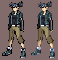
Part of that was a cop-out. I DO like colored outlines, now that I understand them. What I should've said is that "I don't like MY colored outlines" because I didn't know how to make them look good the way the professionals did. If you look at the sprite up above, you can see that on the colored outline version there IS a lot of definition loss and things look blurry (specifically where the skin outlines are, and most of the shoes). Yet when you look, say, a sprite by Capcom, you can see the sprite vividly, no matter what the background is. I couldn't wrap my mind around why or how that was done until back in the day (on Pixelation, a message board I used to run) a few of us started taking apart sprites to figure it out. I credit the initial discovery to a guy named blue_munkee (who's excellent tutorial on selout can at the time of writing be found here, and should be read by anyone reading this tutorial chapter). I remember him busting out the idea in a thread and the rest of us being floored by how simple but logical it was. We spent a ton of time analyzing the concept and testing it out, and I can still recall thinking "There's no way people do this by HAND...there's got to be some kind of filter or macro a person can use..." Years later, I figure it IS done by hand, because I DO it by hand, and after you do it for a while, like blue_munkee says in his tutorial, "it becomes second nature."
With all that build-up out of the way, let's get onto things...first I'll run you through a sprite stage by stage, because it's been a while:


I start with the rough silhouette, getting the basic shape, stance, and proportions down. Then a rough outline, just to figure out where the limbs are, and get some basic features going. From there, I tighten it up into a clean set of outlines. Then a co-worker walks by the screen and goes "Dude, is that the guy from Tekken?" and I suddenly realize he looks like Jin Kazama, curse both my co-worker and the universe under my breath, and then tweak him into an original character. After that, flat-shading...just choosing the basic colors. With the flats chosen, I move onto shading:


Here we go from flat-shaded, to basic shading. Since the point of this whole thing is to explore colored outlines, let's throw basic ones on:


The sprite on the right is now like the girl's sprite at the top of this page, where the outlines look blurry and ugly. All I've done here is go over the black outlines with a darker shade of the color inside them. The skin and the shoes are the most affect by "ugliness", which can be seen in the smaller version of the colored outline sprite. So the question is, why does that happen and how do we fix it? The jist of why that happens is simply that a color looks better against some colors than it does against others. Black looks fine against the pink background, but the brownish skin color doesn't. If you have a character wearing white, so their outlines are light grey, and they enter a winter level where most of the backgrounds are white and light grey, it's going to be hard to see that character. That's just simple logic. The question is, how do we get around that?
Let's say this sprite decides to become a pixel artist, but he goes and commits the horrific crime of producing a tileset that has an obvious grid to it...so he gets thrown in prison, where they give him a white uniform:


It's easy to keep an eye on him, he stands out like a beacon in the night...until he walks in front of a white wall. Now suddenly he's invisible and sneaking up behind an unsuspecting guard to knock him out and make his escape. That's no good...so they throw him in a black uniform:


Brilliant idea, let's dress our prisoners up like NINJAS. Anyway, once more he can be seen, especially in front of the white wall from before...but this time he waits until night and sneaks around dark corridors, again knocking out guards and making his escape. So how do we make sure we're going to see him no matter what background he's in front of? We bust out prison stripes which for all I know were invented for this exact reason:


Now looking at him may burn your retinas a little, but at least you can see where he is at all times. The prison guards thank you and rest a little easier on their patrol. Another positive aspect of this concept is that mimes foolishly wear similar clothing, so we can easily see and avoid them with their creepy invisible boxes and ropes. So how do we apply this to pixel art? That's where Selective Outlining comes in.


We start with the basic outlined version from earlier, which consisted of 3 shades for a color (we'll focus on the skin on the arm for now): The light shade for lit areas on the skin, a medium shade for the shaded areas on the skin, and a dark shade for the outlines around the whole thing. What we do next is use the medium shade for the outline around the light shaded skin. So where medium shade touches the outline, dark shade is used as the outline...where light shade touches the outline, medium shade is used as the outline. A nice, simple "formula". Same thing with the legs, shoes, etc. but again, let's focus on the arms because they're the easiest to see. We've got a little more detail to our colored outlines, but the problem still remains...the medium shade blurs horribly against the pink background, and the dark shade blurs only slightly less horribly. So here's where we apply the prison stripe concept. In the third pic, you can see that now we've got dark pixels on the outer edges of the medium outlines. Same thing with the background leg...there are dark green pixels on the medium green outlines. Now when you compare the small versions, you can see that things stay more defined with the selout versions, because even if some of the pixels vanish, other pixels show up, creating enough of a shape that your mind can assume the rest.
There's a principle in art that's based around "implied lines" which summarized quickly basically says that you can have a gap in a line and the viewer's brain, seeing the two pieces aligned just right aside from that gap, will connect the two as if it were one line...not visually (like a line isn't going to magically be drawn on a piece of paper), but mentally the person's mind will register the shape as solid...so if you show 3 sides of a square, well, that square could go on endlessly for all you know...but if you show 3 sides of a square and on the gap side have very slight bits of that last side at the extreme edges so there's a big gap in the middle, your mind will connect that as if it were a square because it's following the "implied line" suggested by the bits at the edges. This is how a dotted line works...you don't see the entire line, but your brain finds one because it's implied. That's why you can make out the shape of his arm when selout is applied. Part of it may blur, but the other part shows up enough that you can see the implied shape. So how do we know where and how to place these selout pixels on a line? There IS a logic behind it...The general idea is that you want to apply it to the "ends" of outlines. Let's look at an example:

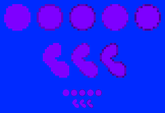
Starting with the circle, we've got a purply-blue circle on a blue background...at 100%, it's hard to make out and burns your eyes to look at. Add a dark outline and it's better...you can tell it's a circular shape. But it still doesn't really "jump out" at you. Adding selout to the outside edges of the circle, you get the middle circle which is nice and crisp and clear and perfect. The way to think about where to add selout is basically picture the edges as being tubes full of liquid...anywhere one of the ends of those tubes meets a background color, the liquid is going to pour out, so you want to add a dark pixel to "cap" that tube. The liquid can pour inside into your shape, that's totally fine, but you don't want it to escape out into the background. The 4th circle is an example without the tubes...just purely the capping of the imaginary outlines. Now the 5th circle is totally wrong, it's what most people do when they start selout'ing and don't know what they're doing. The tubes on that circle are full of dark liquid and capped with light caps...you want it the other way around, light tubes capped with dark caps. Below the circles is a random shape to show some more variety. When you get to a diagnol outline, you sort of have to use your own discretion...personally, I like to leave the diagnol as a line of light pixels if it's longer than, say, 3 pixels...but darken it if it's shorter. If you have a perfect 45 degree diagnol line and you darken parts of it and leave other parts light, you'll get a weird jagged look to it, so in a perfect diagnol line you're pretty much stuck going either fully light or fully dark for it.
But then, you shouldn't be running into a lot of perfectly straight diagnols or horizontal/vertical lines if you're making a character anyway. Don't do this:

...that physically hurt to draw. Every time you make a character based around perfect 8 direction angles, a kitten is stomped. A cute one. That belongs to a mischevious but loveable orphan. Who has no arms.


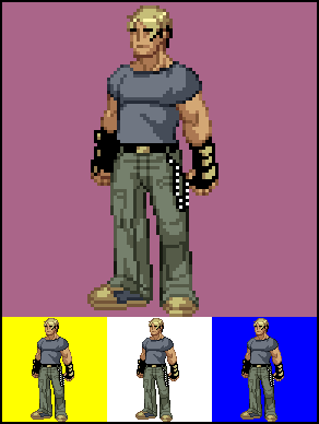
Here, we've got selout on the dark lines too (the underside of his arm), which helps to further bring out the full shape of his arm. Compare the first of the three small images and the last, and the difference is extremely noticable. We've also applied it to the face (jawline in particular) and everywhere else. To test how your selout is working, just change the background color to various colors (including black and white) while zoomed out to 100% and see if the shapes hold their form. When I first started messing with selout, I'd post my tests in a form like this:

...to demonstrate that you can see the sprite on different backgrounds. Now we're grooving along, selouting everything we can see...and it looks great, except that adding that 4th shade (the selout on the dark outlines), we've upped our color count from 15 colors to 19. Generally, a game sprite is going to be limited to 16 colors (15 for the character, 1 for transparency). But the selout technique works! How do we apply selout, without increasing the color count? Well, we can do what Capcom does in the Capcom VS SNK style, which looks like so:


Instead of making outlines, we let the solid color go right to the edge, like in the circles up above, and simply selout that. So the light skin goes to the edge and is selout'ed with medium skin, and the medium skin goes right to the edge and is selout'ed with the dark skin. This keeps the concept of selout working, because you have two colors against any background to form the outline of an object...but this method doesn't really add colors. Keep in mind that this method can bulk the character up a little, which may or may not be an effect you want. Because more space is dedicated to lighter arm pixels, the arm looks bigger than it does when the edge pixels are dark outlines (remember that when you're working in pixels, one pixel can make a big difference...if your character's arm is 4 pixels thick, two pixels is HALF of that arm). At the end of the day, the selout style you go with, much like the shading style, depends on your needs and the overall look you want:


Both of these sprites use the exact same 15 colors, but the one on the right is shaded with a lot more "depth" because it uses the dark colors from the outlines as actual shades within the outlines. The style comes out as more "realistic" than the simpler version, which looks "cel shaded" (this is generally the difference between SNK sprites and Capcom sprites...SNK uses more realistic shading, proportions, and designs, and Capcom goes for the more exaggerated). Keep in mind though, that the heavier shaded version also takes longer to make than cel-shaded (because you have more shading to worry about), and cel-shaded with selout'ed outlines takes longer to make than cel-shaded with black outlines...so if you have deadlines for your sprites, you'll want to adjust your style based on how much development time a specific style requires.
Back to main...
