So You Want To Be A Pixel Artist?
My name is Tsugumo, and this is what I know.
Chapter 10: Breathing Life Into Your Sprites
There are a LOT of animated GIFs on this page...The more there are, the slower they all run, so they may move a bit sluggish. You should be able to right-click them and choose View Image (in Netscape, I don't know what the equivalent is in Internet Explorer or Opera or whatever other browser you may be using) so that you just see the image by itself, and the speed will be a lot better.
So you can make a sprite now. You've got this great looking character and everyone has said how cool the character is...but something's missing. Your sprite is still just sitting there like a cardboard cutout. Let's start breathing some life into the sprite by starting out with, coincidently enough, making a breathing animation. But first, as usual, let's take a look at some Capcom examples and study them so we know where we're going to go with this:


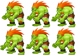
Let's start by looking at the amount of motion that goes into the breathing animations. On the top left we have Balrog who's bouncing energetically, ready to pound his opponent into the ground in a "Bring it on, punk!!" way. Lots of movement and spring in his animation. Way down on the other end (the bottom right), we have Guy...almost completely motionless, breathing relaxed and calm in a quiet "Come near me and I'm going to make you regret it..." way. The animation you give your character should be based on their personality and fighting style. Of course that isn't to say that this is all for fighting games...In any type of game where you have a sprite with a breathing animation, this type of thing applies. I'm using fighting games and fighting game terminology for references and examples because they're good examples of sprite animation. Take what you learn and apply it in the way that you need...that's the key. So we've covered general motion...but there's something more specific about the motion we need to look at.
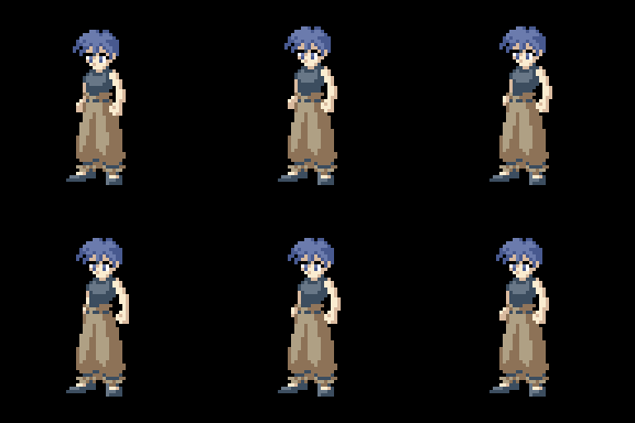
Sprite size is extremely important now. When you're working with a large sprite like the above characters, you can get away with a lot of different types of breathing...but if you look at the heads of some of the characters, you can see that they really don't move very much. Cody's head (the guy in the jailbird outfit) just raises one pixel, slides to the side two pixels, then lowers a pixel and cycles back through the positions. Gen's head (the guy in the purple kung fu clothes) just slides back and forth. Guy's head doesn't even MOVE. This is important to note because if you're trying to pull off a calm character, you don't want their head bouncing around as much as Balrog or Blanka. But remember, these are large sprites. When you take the logic that "if I move the body just a pixel at a time, I can create a breathing animation" and apply to a smaller sprite, you can get something that looks like this:

Logically, the character only moves a few pixels...The head moves up one pixel, then to the side one pixel, and cycles back. This is basically what Cody's head did. So why does THIS character look like he's trying to elbow people behind him while headbutting them or something insane? It's because when you have a sprite that's 100 pixels wide and you move part of it 1 pixel (1% of the width) to the right, it's a very small, subtle movement. When you have a sprite that's only 20 pixels wide, and you move it 1 pixel (4%) to the right, it's visually moving 4 times as much as a 100 pixel sprite would. This difference in sizes can create a lot of problems and once more, you have to throw logic out the window. There's some magical sprite size (based on your character's size and shape) that works as the barrier point for the breathing animations. If you go below it, you won't be able to make a good animation, and if you're above it, you're okay. This is why you can have a nice big sprite breathe however you want, but have to play it safe with smaller ones...
"But what about the old games like Final Fight, the Ninja Turtles arcade game, etc.? I'm sure I remember those characters breathing." Sorry, my friend, but your memory is playing tricks on you. I thought the same thing until I went and took another look at the games...The characters don't move at all. The TMNT move, but they don't "breathe" (they don't look like they're inhaling and exhaling air)...they use an "idle animation". An idle animation is what the character does when they're bored. If you waited a second, Sonic would tap his foot...Bubsy would knock on the screen and shout at you...Raphael would spin his sai. With the small sprite sizes, these kinds of things were possible to do because they're fairly large, expressive movements with no subtle chest expanding and all. But that's another subject, and we're talking about breathing specifically right now...so just keep in mind that if you're working with a small sprite, you might not want to give it a breathing animation. If it's a small enough sprite, no one will notice anyway. No one expects to see a 16x16 RPG character breathing slowly...BUT, the catch is that if your sprite is big enough and DOESN'T breathe, people WILL notice. It's a juggling act and there's no formula for it...it all depends on the shape and size of the character you're working with. Anyway, let's move on to another important part.
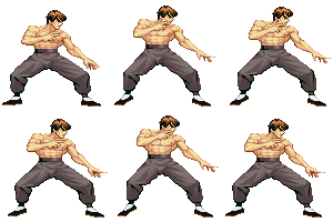
In the last chapter, I explained that a good method for creating animations is to hand draw your frames and retrace them in pixels because you don't have to "think" as much when you're doing the pixel process. Logic tells you "I want to make my character hop back and forth like Fei Long, so I'll draw each of the frames, scan them in, and retrace them." Once more, logic must take another trip out the window. You see, you're an artist. You have a TON of graphics to do for this game and maybe you have a programmer who's casually saying "Hey, how about you make that guy do a flipping kick?" without understanding just how many more frames that means you're going to have to draw, and no one appreciates you because you're just the guy that draws all day...your job is easy. Well YOU know that it's NOT easy...so why make it harder on yourself by redrawing every frame and retracing drawings when you don't have to? Check out Fei Long once more:

He's looking pretty animated and he's got his little hop going on and all...but look at him closely, specifically his chest. His chest does NOT change it's form. The only thing that changes in his chest is the top chunk is shifted up one pixel around the abs when he reaches the height of his bounce. The shading and muscle structure is exactly the same through the entire animation cycle. Check out his head...It doesn't change except for a few pixels of hair that bounce. Did the artist retrace these parts from the hand-drawn images each time and get the pixel structure looking exactly the same just because the hand-drawn images were THAT good? No, of course not! It's done with the magically wonderful set of tools known as cut and paste. Cut and paste will be your best friend when you're animating sprites. Now, while I haven't seen the hand-drawn images of Fei Long's breathing, I'm going to go out on a limb and guess that the first body and and head are drawn with full details...but that the frames that follow use a simplified body (just the general shape of the outside edges) and head (just the shape of the head). Maybe on some of the frames there's a little note that says "move chest 1 pixel down" or "make hair bounce up during frames 2 and 3"...but there's no reason to DRAW the hair bouncing up and down, because when you scan in the images and shrink them down, they'll look like a blur of pixels anyway.
This is where it becomes important that you learn to become one with the pixels and make them bend to your will. You are the artist, and you OWN those pixels...and if you don't, then keep practicing until you do. If you become proficient at drawing in the pixel stage, you can shave off HOURS of mindless work. Look at Fei Long's arm (by his chin). It bounces around and flexes and everything...But why waste time hand-drawing that and retracing a frame for it, when you can simply cut and paste the hand down a few pixels, change the fingers to a new position, and touch up the pixels on the forearm so they line up right in the new position. You can even do that kind of thing with the legs...they only move a few pixels at a time, and the shading just changes slightly. Just do that kind of thing in the pixel stage and you can essentially draw just ONE frame for your breathing animation. When you think about it, if you hand-draw two frames and in one you have the fingers touching eachother and in the other you have the fingers spread apart slightly...they're both going to just look like blobs of pixels when you shrink them down to retrace. In the end you're going to have to go with your gut and push pixels around until they look right anyway...so the hand-drawn image was a waste of time and effort. Remember, you have a lot of other stuff to do, so don't make things harder on yourself than you have to. If you're animating a character who's doing a punch, and all that changes is his arm, just draw that arm and part of the body (for lining up purposes) in the hand-drawn pictures instead of retracing the entire body and every detail when it doesn't move at all. Okay, maybe this could be considered slacking off and taking the easy way out...but hey, we're artists. That's what we do. And if anyone asks, we're simply being "strategically energetic", heh...Anyway, let's move into doing this step by step starting with a sprite I just made:

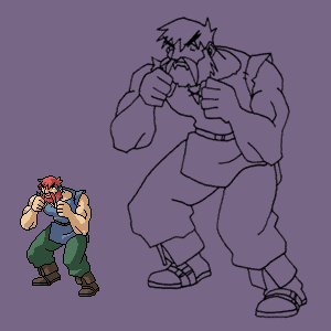
He's 110 pixels tall and ready to do some brawling. I'm going to do the breathing animation just using pixels. If I was going to do an animation as varying as Blanka's, I might do each of the frames separately because there's enough movement to warrant it, but for the purposes of this tutorial, I'm going to go with the cut and paste touch-up method. The general plan I have in my head is that he's going to have his upper body bouncing up and down while his fists move up and down at opposite times (when one fist is up the other is down), and his thighs will flex down slightly so he's got a little bounce. Maybe I'll have his ankles his ankles bend a little so he feels fully animated. But that's all in my head right now and I have to pixelize it. So the first thing I'm going to do is start by doing the largest chunk of movement...I'm going to just shift the upper body up two pixels. My thought is that I want to have him breathing heavy so he's going to inhale deep and fast, and as he reaches the height of his inhaling, his chest movement slows down (like how you slow down in the air when you reach the height of your jump), then he exhales fast and slows down when he reaches the end of his exhale. That means that to animate it, I want to have him move a larger distance of pixels during the fast breathing, and less pixels during the height of the breathing. So anyway, I'm going to get the chest movement going first:


Okay, he's got the breathing thing going on with a 4 frame cycle. By shifting the chest up and down and fixing up the stray pixels, I got the animation on the left. Photoshop is really nice for doing this cutting and pasting, because you can use the rectangle marquee selecting tool to select only the pixels that you want to move (using the 'SHIFT' key to add to the selection). Anyway, the animation on the left isn't bad...he looks like he's breathing. But it's all a little too monotonous. All of the frames have the same delay on them so he just slides up and down up and down up and down. I decided I didn't like how robotic this looked, so I messed with the animation timing and had it so when he reaches the height of his breathing (both inhaling and exhaling), the frame is shown for twice as long as the "transition" frames (the frames in between). Now it looks like he's taking deeper breaths and has a little bit more of a realistic feeling to him. Messing around with the speed, I can create a few different effects...if I have him breathing in really fast, then slowly breathing out, it's like he's out of breath. If I have him breathing in slowly and out fast, he'll look like trying to control his breathing and calm down. It just takes a little bit of messing around to make things look how you want. Oh, and when I was touching up pixels, I changed a few on his chest (the shading) so the chest doesn't look totally motionless. The change in the shading suggests that his chest is expanding or contracting or what have you. Now he's breathing, but he's not looking animated enough...He needs some leg movements. So again with the cutting and pasting and fixing up pixels, and I end up with this:

Now he looks a bit more lively. He's bouncing a lot like Balrog was up above in the examples (Balrog was the general basis of this sprite because I like Balrog's stance/animation, heh). This took a bit of work to fix up. In the first breathing animation, I simply had 4 different frames where the chest shifted up and down. This time though, I wanted the whole body from the thighs up to move so the legs flex a bit. This meant that the single pixel movement at the height of the breathing (remember 2 pixels first, then 1 pixel so he reaches the "peak" realistically) suddenly became a 2 pixel movement because I first shifted the torso, then I took the torso and thighs and shifted them again. This was too much and not the effect I wanted, so I ended up killing off 2 of the frames from the first animation (the highest and lowest points in his bounce) and basically shifting them again, but while grabbing the thighs with the torso this time, and then fixing up the legs to reflect the new positions. Now I'm going to fill in a few details:

I made his feet change slightly...the heels and cloth flaps now move a bit. They don't move a lot and they don't HAVE to move a lot. As long as you provide just a pixel or two of animation, it'll look a bit more lively to the player's eye. I made the flap that hangs down from his shirt change it's shape slightly to reflect the movement of his thigh underneath it...Then I smoothed out the shading on his belly so it would flow a little smoother. Finally I sped the animation up slightly. I might increase it a little more later on to make him seem a bit more anxious, but the animation speed can be adjusted once the frames are all finished. Now comes animating the arms, which will probably prove to be the hardest because they'll take the most redrawing:

And they WERE the hardest, heh...I decided to go with circular motions for no reason in particular. Since the hands had to make complete circles I couldn't just flip through 4 frames in the order of 1-2-3-4-3-2-1-2-3-4... like before because he would just do half-circles and it would look odd. So I had to make 6 separate frames and reposition the hands in each. It was kind of a pain, but now he's got his entire body moving. Okay, so it looks like he's doing some sort of boogie to background music, but you should be able to get the idea...If I had planned out the fist movement, I could have gotten something a little less dance-like, but I'm making these tutorial examples up as I go so this will do, heh. I probably could have had his hands just shift up and down a few pixels together and ended up with a Sagat Muay Thai type animation, but the circles work okay. Again, it all depends on your character and their attitude/personality/fighting style/etc. And always remember to cut corners wherever you can and make things easier on yourself. If you're just changing small parts, do it in the pixel stage.
-----
I received some comments about the animation looking kind of odd...the reasons ranging from what a horrible idea it would be to open your stance up like that, to the arm movement not looking natural (only the forearms move, the upper arms don't really change), to some other things. I was tempted to just say, "Well, that's what his fighting stance is. It's just a tutorial example, so it doesn't really matter...and if he was IN a fighting game, you'd think "oh, it's a fighting stance" anyway, so I'm not going to change it." But then I remembered how irritating it is when other people do this. When someone asks for some feedback on their sprite and I point out some parts that could be changed and they roll out a bunch of excuses and rambling about how it's SUPPOSED to be that way...I just shake my head sadly and move on. You don't learn by ignoring what other people say...even if you put a week into working on one sprite and you can't imagine possibly going back and reworking parts of it because you put so much effort into it...if someone tells you that the arm looks extremely weird, you fix it. Even if it feels like a kick in the nuts to do it and you really want to just say "no, it's good enough", you have to go back and rethink things...Why? Because it's all about how the sprite looks. If it means putting some extra work to get it to look just right, then that's what you have to do. It's like when people draw characters that are horribly out of proportion and it's clear that they've never actually studied anatomy or anything, and when they ask for help you tell them the character looks a bit wonky, and they just go "Well that's my STYLE. I meant to do it that way." Sometimes it is, but most of the time it's just covering their butts and deep down they KNOW it looks wrong but just don't want to change it because it's hard to do...So anyway, in hopes of setting a good example for those of you reading this, I decided to redo the animation to make it nicer:

I killed the whole circling arm idea and went with simply delaying the drop of the arms, so that they lag behind his body motion by a pixel at the height...This small movement can add a lot for making the animation look nautral. It's only a pixel or two of movement, but it creates that feeling that the hands aren't glued to his chest...they extend in front and move separately. Another idea might be to have one fist lag slightly longer than the other. It's like you're breaking up chunks and moving them...When the whole upper body just shifts up and down together (like in the first animations), it feels like the body is one solid chunk. By making the arms lag slightly, even just by a pixel, it breaks those arms away from the body, so there are two chunks. To break it down even further, having one fist lag longer than the other would create 3 chunks and possibly make it feel a little more realistic. However, then the question is "Do I want this character to be moving THAT much?" and you have to reason out whether they'd have their arms moving at a controlled speed together, or have one going at a different time than another. Like in the Capcom animations at the start of the chapter, Blanka's arms move at the same time because he's moving with a big hulking monstery type motion...whereas Gen's doing a little circling motion with each arm. So like I say, it all depends on the type of character you're creating.
And sometimes like they say, "less is more". The tutorial character's arms moved in big animated circles before and it didn't look right...now he just shifts his arms slightly but somehow it looks a lot nicer. You don't always need an extreme amount of movement to show a character animating, especially in a breathing cycle where the character is essentially just killing time before he attacks. So if something doesn't seem right, and it just feels too overdone, try toning down the animation a bit and you might come out with something that looks a lot more natural. Never make things harder on yourself than they have to be.
Back to main...


