So You Want To Be A Pixel Artist?
My name is Tsugumo, and this is what I know.
Chapter 1: The Almighty Grass Tile
Ah yes, the grass tile...Generally the first tile anyone does, because hey, if you're making an RPG, and you plan to have it take place on a world, you're probably going to need grass. It's a good way to warm up and get into drawing the tiles, so let's start with it.
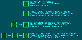
Let's cover some different methods of making grass. You've probably seen these, if you've checked out a lot of games:

These aren't all the methods, of course, but these are some popular ones. One that I didn't both to even make a graphic for is just a green tile, heh...As amusing as that sounds, a lot of people DO try to get away with this, because grass is green so logically a green tile will look like grass, right? Heheh...Not so. And this is the problem both of the top two tiles have. They're basically green with a few sparse dots on it. They DO represent grass to a player walking around because if there's nothing else around that's green and there's trees all over, then in their head they figure it MUST be grass...But what it really looks like is a smooth plate of green metal with some dents and bulges in it, or maybe a sheet of green tinted glass...Maybe a big flat green rock. What these all have in common is that they are FLAT, and as a result, are generally boring when it comes to grass. Grass, when you think about it, is millions of tiny blades randomly growing at different upward angles, and unless it's been stamped down flat or mowed to perfection, doesn't look smooth. So why make a tile that does?
So then we come to the more "complex" grass tiles...The ones that have tons of dots in them. One common method of making these is to simply take your paint program's "spray" tool and spray down a bunch of random pixels in the different shades of green, and take a 16x16 chunk out of the middle and use that. Which works, but the problem with totally random pixel placement is that you sometimes end up with parts that don't work well (large gaps of one shade of green for instance), like in the example in the top right corner there's a large dark green gap...This will harm the look of the tile when we come to actually using the tile, which I'll explain a bit later.
Another method is to simply paintstakingly draw in the blades, going from shade to shade. This can get annoying, but the trick is to not think about it too much, just start doing some random strokes of up to 4 pixels. A way to cheat is to make a few strokes like that, then cut and paste those strokes around the tile and cut and paste a new chunk every few pastes so it still looks somewhat random, heh. Much faster. This method is the one I personally use because I like to have more control over what my grass is going to look like and I find that with the spray method I end up having to go back and fix it up a bit so it works better on a map, so I just go with drawing them out from scratch. This is also a good method for making "thick" grass, like you'd find in a forest where no one has mowed the grass...The upward strands make it seem taller and thicker. Incidently if I were to take and rotate the tile 90 degrees so the lines were going horizontally, it would look as if the grass had been stamped down by people walking on it. Just something to keep in mind (small things like changing the angle of the pixels can alter the whole look of the tile).
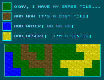
Now you can use whatever method you like, and there are a lot of different ones...Just remember that grass shouldn't look totally flat, and using the same tile and just changing the shades looks horrible:

Do not, I repeat do NOT do this. I guess I should explain why exactly...other than the fact that it really looks ugly, heh. A big problem is the repetitive texture. It's the exact same design with different colors. Now imagine the old days, when an engine scrolled not by pixel, but by jumping tile to tile (16 pixels with each press of a direction). Now what would happen is when you're going along, since the tiles wouldn't scroll, they'd just be replaced instantly by the next tile in the direction you're going. This demonstrates the problems with using the same tile with color swaps, as say you were walking along that chunk of map in the above image...You could hold down the right direction and all you would see is the color of the tile change. No difference in the texture at all, and it gets boring and eventually hard on the eyes to differentiate between the different land types because you just focus on the pattern which looks the same. This same effect is noticable if you've ever been walking on a large area of grass tiles that all look the same...You could hold down the key for an hour and never know if you're still walking or if you're bumping against the edge of the map and not going anywhere, because everything looks the same. Granted, this isn't as bad with a pixel scrolling engine, but the patterns STILL look the same and will bug the player.
Back to main...
